Following the company’s trajectory, the new branding reflects the zeal for quality and care for life.
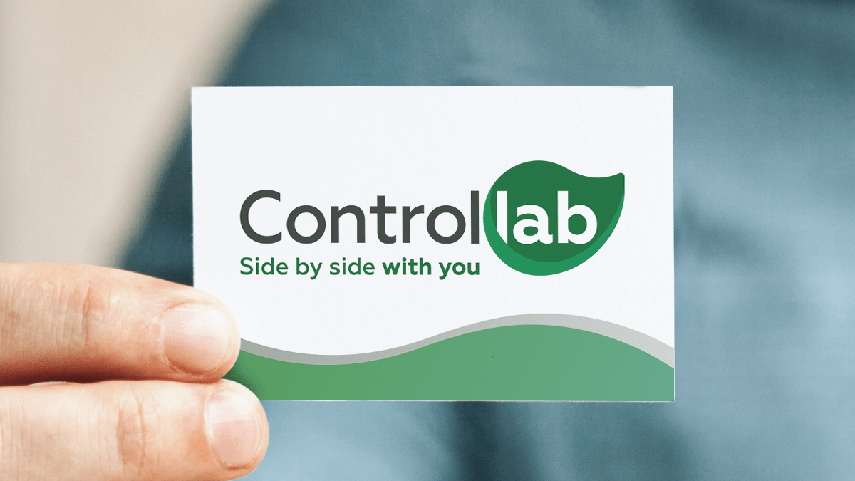
Controllab presents its new logo, which is more modern and aligned with the company’s transformation guidelines. The color concepts have been maintained and the outlines are more fluid. The essence of the logo has been preserved.
“In 2020, we rediscovered the meaning of the verb caring together. The new Controllab’s identity highlights not only our search for modern services, but also highlights the care and attention that guide our mission in providing solutions for quality,” explains Flávia Mirian, marketing manager.

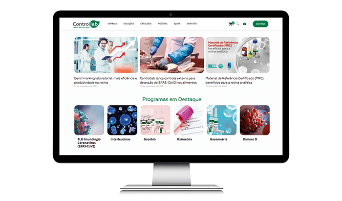
Amid the announcement of the new logo, the company also launched a new website, aligned with the constant technological developments in its services. The site brings a friendlier interface, which privileges the published contents. Besides, the services have identities that follows the new symbol and the quality programs catalog is on digital format.
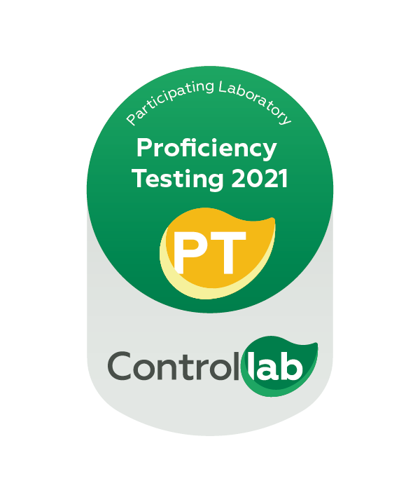
Following the changes, the CQ (Quality Control) Seal was updated, for the exclusive use of the participants in the Controllab Proficiency Testing. The CQ Seal confers reliability to the reports. It is used by laboratories to show their investment in quality to their public.
In order for users to correctly apply the QC Seal, Controllab has made the Brand Identity and Use Manual available on the website, which includes the criteria and rules for using the seal.
Flávia Mirian points out that the process for implementing the new visual identity will occur gradually. “The new logo is even stronger and its modernization shows that Controllab is attentive to market demands”.

